September 13
Start of Year 2 - Textiles
Started the Year with research of architecture, I looked at gothic Italian churches.
I looked at the detail and the shape of the

buildings and windows, inside and out. in my sketch book I wrote about the lines and organic curves of the buildings - arches and sculptures.


Next, I worked on paper manipulation, folding and cutting paper and card, changing the flat 2D paper into a 3D piece and printed with them into my sketchbook.
I also used different materials to print with e.g. polystyrene - poly print. I had inspiration from the Italian churches, for the shapes I drew into it.


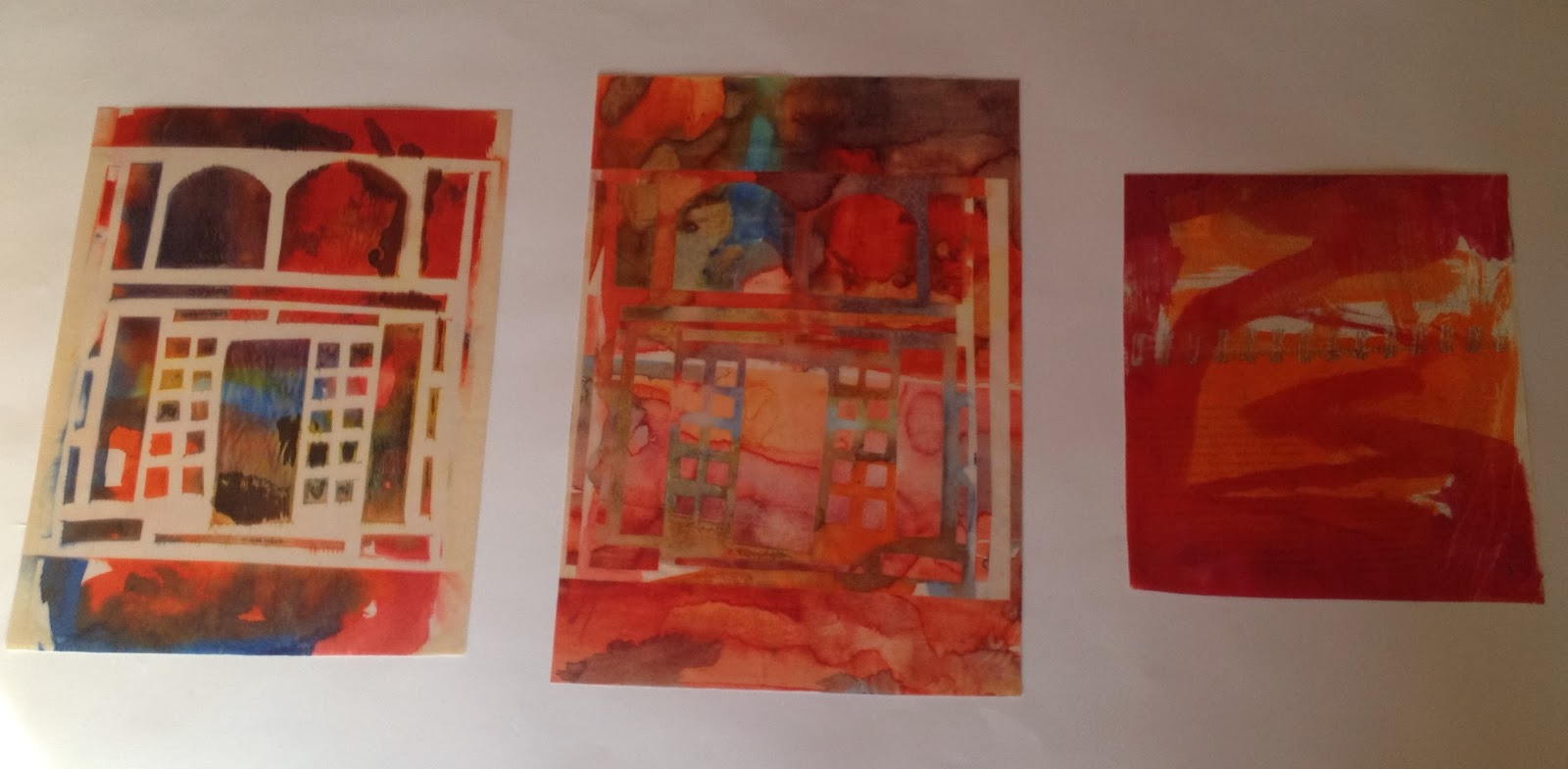
I used silver card to etch onto, cut shapes lightly
and gently and peeled of the silver coating, so the ink would sink into the paper material underneath and wipe of the top of the silver, to create the shapes.


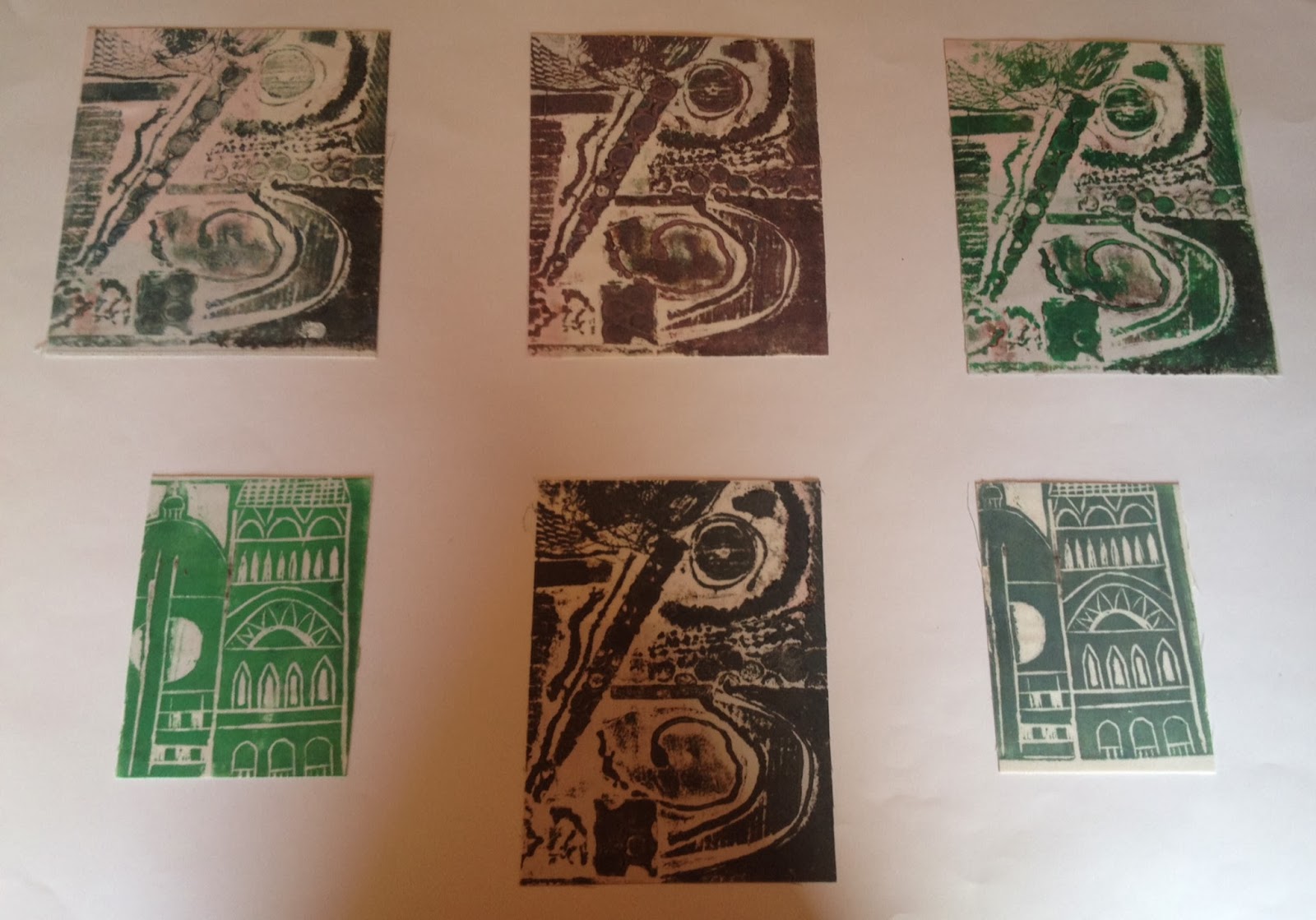
Lino printing - for this I didn't mark make and draw different shapes, I took inspiration from my research and designed my church onto the lino. this was my favourite printing style, as I think the design printed well and looks good on different materials.
This is a photo of my example of a collagraph, I wanted to experiment and find out what all the different materials looked like as a print. I found odd bit around the class room, of different textures to create a range of marks from the print.


I used disperse dyes on paper, transferred it to fabric via the heat press. I made a stencil to block the dye from transferring onto the fabric.


Disperse dye on newspaper and photocopies, transferred to fabric,the design also came
off onto the fabric
from the black ink.


fabric manipulation, using the sewing machine. folding and pleating material to bend/curve and create texture etc.


I used an embellisher to pull and pierce fabric, this created a different texture to the material. you can also draw designs into the fabric with the embellisher, my design was made up of organic curves.

Shibori. tied shells and beads into fabric and steamed, when it comes out of the steamer, the shapes are left in and the fabric is ruffled. I experimented by painting disperse ink onto the fabric and fixing it in with the heat press, so the colours would not run into each other while being steamed, I was successful.


with the silky fabric that I printed on with disperse ink, I cut out a range of different shaped circles and gathered the edge of each circle together using a running stitch. I really like this technique, I like the
folds and bubble shape it
has made with the fabric.


 buildings and windows, inside and out. in my sketch book I wrote about the lines and organic curves of the buildings - arches and sculptures.


 Next, I worked on paper manipulation, folding and cutting paper and card, changing the flat 2D paper into a 3D piece and printed with them into my sketchbook.
 I used silver card to etch onto, cut shapes lightly
 Lino printing - for this I didn't mark make and draw different shapes, I took inspiration from my research and designed my church onto the lino. this was my favourite printing style, as I think the design printed well and looks good on different materials.


 Disperse dye on newspaper and photocopies, transferred to fabric,the design also came


 I used an embellisher to pull and pierce fabric, this created a different texture to the material. you can also draw designs into the fabric with the embellisher, my design was made up of organic curves.
 Shibori. tied shells and beads into fabric and steamed, when it comes out of the steamer, the shapes are left in and the fabric is ruffled. I experimented by painting disperse ink onto the fabric and fixing it in with the heat press, so the colours would not run into each other while being steamed, I was successful.

 DAFF anti-fur project


